Over the last three years I have always found design context quite tricky. I understood research when it comes to finding content of establishing problems in briefs but I never really fully got the research into other people that do what you do.
I have recently understood it a little more with my DC Publication. All through these three years I have talked about how important it is to me to be influenced by individually sought after things instead of other peoples work. I even did a project on it in first year! So after my DC presentation in March I found out that there is indeed no point being really good at drawing to get into an agency unless you have something different about you so they hire you to be another asset to their agency. So this is where 'Draw inspiration' (my dc publication) came into play. By looking at interviews, the artwork itself as well as asking a few first hand questions to a few of my favourite illustrators, it broadened my mind into what else I could be influenced by. one answer in particular said that she doesn't get inspired by objects or anything like that, she gets inspired by the brief itself. This made me feel much better in the way that I have always worried that I don't have a constant style, I just do what is best for the brief.
Other answers made me see so clearly why that illustrators drawing is how it is, weather it was it's tone or stroke or colour, I could relate that to how they think, and in doing that assess that relationship in my brain.
I decided to do the documentation of this in prints as I wanted to have two clear parts to this. What influences my favourite illustrators, and what influences me. This way I could compare their relationship between their thoughts and their work alongside mine.
I am glad I finally came to terms with what Design Context meant to me and I am pleased with the result and said to some of the illustrators that they can have a copy. I hope to add to it as time goes by.
Brief 9 Final Boards & design development
SEE DISK
Brief 8 Serco Prize for Illustration Final Boards
/
Summary
/
I didn't devote a lot of time to this brief and I am kind of glad that I didn't. It was a really good idea to have a really quick turn around brief in there to keep my creative juices flowing and get something out there and take a risk. I am pleased with the concept I took however, I think that certain parts of the drawing are slightly sloppy but I think that scale and detail helps this and it becomes a print that you can see from afar as well as enjoying seeing up close.
Having it picked as a nominee for the Serco Prize for Illustration was also such a huge lift for me. I'm so excited to see it in that gallery and even if I don't win I feel proud to have at least got it that far.
This brief opened my eyes properly to competitions. They're such a positive thing to be doing and it has encouraged me to look around much more and to enter as many as I can to keep my ticking over and to hopefully start to get my name out there.
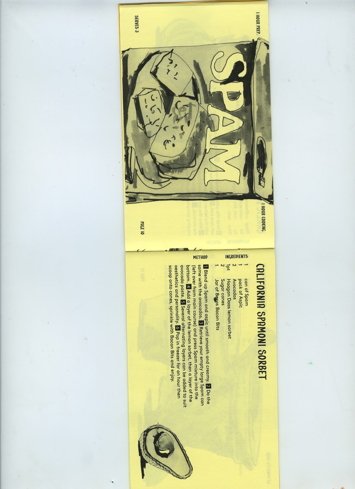
Brief 6 Recipe Book Collaboration Final Boards & design development
/
Summary
/
This brief was a favourite of mine. I have always wanted to illustrate a recipe book and I'm so glad I finally got to do it. In this collaboration my role was to provide the content as well as all of the imagery, layout of the imagery, contribution to format and colour decisions and the screen printing. I think that I full filled these tasks to their full extent.
This brief was very much running in the back for a long time. I was ticking away at the 100 odd water coloured drawings over the last few months and it all came together pretty smoothly at the end. Aaron and I worked well as a team and our tastes hardly contrasted, especially when it came to format and colour decisions. I am pleased that compared to my first idea of this brief I came out with an edgier response. It will play a key part in my portfolio of a conceptual piece and to show how I can work well in a collaboration.
I am pleased with the aesthetic of the range. The colour scheme is really punchy and the illustrations work really well in one colour. If I could change anything I would change the amount of recipes in each book. I'd love them to be more substantial so we could have bound them with hard covers and buckram. However, aaron and I have talked of re visiting and pushing them further.
This brief made me feel much happier in establishing the role I want to play upon leaving. It was great to not have to worry about the type setting of such a project. I loved putting to skills together to improve and bring out the other. At the same time though the two designers are in control of the other. IT was very much about you have the skills but we both have the vision so it was like having 3 hands to achieve exactly what your vision was. It is something that I want to do much more of in the future.
Brief 5 Wrapping Paper Final Boards & design development
/
(latest Hallmark development on disk)
Summary
/
This brief was probably the hardest of them all. If it wasn't for my placement I probably would have discontinued it. It proved to be a massive downer on my confidence and was infecting the attitude I had on my other briefs. It took me a long time to take off as I couldn't get the Crufts wrapping paper range to kick off. I'm still disappointed that this didn't work as the concept was there using the categories to make humorous pattern designs. After it moved onto a range of wrapping paper for Urban Outfitters-using their gift range and failed again I really hit rock bottom.
However, my placement allowed me to relax a little and just produce imagery with no pressure to be for a certain pattern etc. I went on to design a multitude of different possible ranges and really enjoyed doing so. My favourites would be the character cards as well as the more traditional water colour cards with the script hand drawn type. They sum me up in a nit shell in the way that I can draw for different audiences.
Because of this late take off I don't think I pushed the brief very well at all. I was happy to keep it as a smaller brief but there turned out to be so much scope for improvement and involvement of more products rather than just artwork. However it has provided a fill for a hole in my portfolio and perhaps I will re visit it to do it up in to a fuller range and re visit the christmas tree decoration idea.
Brief 4 Puffin Book Final Boards & design development
/
Summary
/
I chose this brief as I enjoyed its parent brief the Penguin book cover in the last module. It took a while to take off as I was struggling with the type as image requirment. However, this proved to be such a great brief to pick as I haven't done anything like that before and it pushed me out of my comfort zone and showed potential of a new area of working.
I don't think that the imagery is constantly very strong. Im happy with the overall aesthetic of the main book cover but i could have spent even more time drawing them out even one more time. This was the same on the sub book covers. I think that the Conderella, Frog Prince and Rapunzel covers are much stronger than the others. Weather this is to do with colour, stroke or detail I don't feel hugely satisfied with those drawings.
However, I think that the overall appearance of the books is smart and different. The dark covers with bright white hand drawn type I think works really well. This is another brief where I have really developed my hand drawn type and I will continue to do so as I leave.
Deliverables wise I feel as though I could have gone on further but I am happy with what I made. The book ends are a favourite of mine as they push the project out of being 2-d and into becoming a product which is really important to me to demonstrate. I also am pleased with the bookmarks as it took em a while to find that interactivity that I wanted from them but I found a simple solution in the way that they provide image to a page with no text on by being see through.
This is a project that will be in my portfolio and I hope it will stand out as being one of the freshest pieces of work due to its modernised strict colour scheme and alternative deliverables.
Brief 3 GBK Final Boards & design development
/
Summary
/
i feel as though I worked that hardest on this brief. From it I wanted to achieve a good range that like Brief 2 Colgate demonstrated how I can be given content and do something functional but new and interesting in the format and deliverables that go with it. The menu acted as a large focus point to this brief. It dictated the tone to the rest of the range. I don't think that this is a bad thing to find something that makes you excited and then reflect that onto other things.
I am pleased with the aesthetic of the main menu. I think that it is a nice thing to have in my portfolio and has demonstrated a massive improvement in awareness of format wand what can be done with it. I feel I have a healthy range but still understand that there could have been a lot more too. i am also pleased with the way that I am able to settle for something simpler and rely on that, rather than dressing something up un necessarily. This is shown with the takeaway range. I feel as though I created a simple but solid concept of using the burger imagery as a real USP to the whole restaurant.
I have said that I would have liked to have expanded the range even further but there are also smaller details that I would have changed too. For example, the type on the brown burger plate in the menu is unacceptable as you can't see the type properly! Also, I should have collaborated with an interior design student to get a greater impression of what it could all look like in context. However, I think that my mock ups on the boards are an improvement of ones I have made before.
In all, I am fond of this brief. I have put the most thought in to it and I hope that pays off in the conceptual responses that I have achieved.
Brief 2 Colgate Kids Final Boards & design development
Summary
/
I had a few things that I wanted to get out fo this brief. I wanted to show how I can solve a problem through the use if illustration as well as modernise yet create functional design to a brand with an already big reputation.
I have found this brief pretty clean in the way that I don't think I had any massive freak outs regarding where it is going or what the problem was that I had to solve. I enjoyed it because I was given content as well as having to find problematic content too. It gave me the perfect scope for playing it safe and then expanding into something more imaginative and inventive.
I feel like I have learnt maybe the most out of this brief. Discussion with Mark helped massively with the development of this project. Brainstorming an colour were two areas of which I worked much harder at to try and nail in order to make a fresh looking project. My understanding of drawing and stroke improved on this brief. The hand rendered type was becoming much more consistent and I have learnt to be more bold with colour. However, I don't think that I pushed myself in informing myself of having that colour printed properly. My main focus on this brief was the content and concepts of the solution and not necessarily the finish. If I could change anything I would go back and improve this to bring it all together fully as a more realistic product that could go straight in to shops.
I think that it has become a key part of my portfolio, acting as a representative to how I can push a brief from essentials to experimental in one range and with a big brand to back it all up. For that I have really enjoyed this brief and don't feel as though I will want to flick through that page in my portfolio too quickly.
5/27/2012
Brief 1 Secret 7 Final Boards & design development
/
>
Summary /
This brief was very much about me starting up my Final Major Project design engines. It accomplished this as it was successful entry to the competition and gave the module a great kick start. As regards the response to the brief, I wasn't completely over the mood with what I made. It was one of those things that you like in front of you but I didn't think of the context that it was going to be in very well. On a wall with others around it, it wasn't punchy enough. If I could change it I would make more of a focus point to the design.
However, the negative space did make it pop slightly, and the crayon effect wasn't one to be seen on others. It felt good to see my name amongst other great Illustrators, designers and typographers. It also improves my CV and gave some potential new contacts.
I don't feel very lucky when it comes to competitions but entering this one and succeeding opened my eyes to the effort that I must make to enter as many as possible as they are great things to do to keep you ticking over, improve your CV and just help get your name out there in general to be involved in the Illustration scene in the area that I want to base myself in.
Overall a positive experience that proved a great short brief to act as an opening to my Final Major Project.
Photographing
/
1300 PHOTOS LATER
knee pads for photographing!
HERES A FEW FROM THE SECOND DAY
Boxing everything up for photographs gave me an idea for submission for this brief..
stay tuned.
Final Crit
/
Voila- I felt good about the feedback I got, there was nothing HUGELY wrong with anything by the sounds of things and I was pleased with the amount of work I had to show. It just about pulling it all together and presenting it as best I can now.
I made the bill on the right and thought this might be a good shout for hand in. I will make it a delivery order.
5/20/2012
Painted!
/
FINALS ready to print
/
INITIAL PLONKING ONTO WHAT AARON HAD GOT DONE
/
secretly been ticking along with recipe illustrations
/
AFTER INITIAL DEVELOPMENT WITH COLOUR-DONE HERE THEY ARE!
The toys are done!!
/
This is what I nearly severed my hand on today making the books ends for my puffin brief.
/
Just need to paint in the detail.
A check up of range for photographing
/
I wanted to check where I was with the amount of work and deliverables. The colgate is missing toys and the books are missing book ends and posters
Crit preparations
/
I did a quick print out to see what the recipe book spreads looked like on coloured stock for the crit. I think it will work well.
This crit went well. I had good feedback in the way that it was picky. This was a good sign because it gave me an impression that there weren't too many large errors and mistakes. I still have ALOT to do but I don't feel too far of track.
I do need to change the signage as I was advised not to involve food with toilets and to use google eyes instead of printed eyes onto the teeth range.
I NEED MORE TIME TO MAKE CHRISTMAS CRACKERS !!
/
I'm going to try and find time tomorrow in between screen printing my bags for my recipe brief to make some crackers or at least one! I wish I had thought of this earlier. This can go on and on but I need to figure out where to stop.